

Cover Art for CDs: A Pro Guide to Print-Ready Design
You finished the mixes. The masters are bounced. The track list is locked. Then the next problem shows up fast. Your CD still needs a face, a front cover, a back panel, and files that won’t fall apart the moment they hit a press.
That’s where a lot of independent artists get stuck.
The music may be strong, but weak packaging changes how people read the project before they hear a note. A blurry front insert, cramped spine text, or artwork built from a low-resolution social post makes the release feel unfinished. Good cover art for CDs does the opposite. It tells fans what kind of record they’re holding, gives DJs and promoters something identifiable, and turns a disc into merch that looks worth buying.
Your Music Is Ready But Is Your Artwork
A common situation in print production looks like this. The artist sends over a finished album and says the artwork is “basically done.” What they really have is a square image made for streaming, a logo pulled from an old flyer, and song titles typed into a phone app. That might work online for a thumbnail. It usually doesn’t hold up when it has to print cleanly inside a jewel case.
Physical packaging still matters because the artwork isn’t decoration. It’s part of how recorded music is organized, identified, and sold. A MusicBrainz cover art snapshot shows 3,725,634 releases with cover art, including over 2 million albums, or 56.2% of those indexed records. That’s a strong reminder that cover art remains a core identity layer for the release format traditionally associated with physical albums.
What the cover needs to do
Your artwork has a job before anyone opens the case.
- Signal the style: A gospel choir record, a street mixtape, and an indie folk EP shouldn’t all look interchangeable.
- Create recognition: Fans should spot it quickly at a merch table, in a car seat, or in a social post announcing the release.
- Support the sale: A CD is a physical object. People judge physical objects by how complete they feel.
- Carry across formats: The same front image often ends up on the disc face, event flyers, stream links, and promo posts.
Practical rule: If the front cover only works at full size and becomes confusing as a small image, the concept probably needs simplification.
Where artists lose time and money
The most expensive artwork mistakes usually start early. Someone designs without a template, uses web images, or forgets that a tray card has folds and spines. Then the fixes happen late, when the release date is close and nobody wants to rebuild the file.
What works is simple. Build the package for print from the start. Decide your packaging type first. Gather sharp source images before layout begins. Keep the front concept strong enough to stand on its own. Then format every printed panel correctly.
That approach saves revisions, avoids reprints, and gives you something you’ll want to sell after the music is finished.
The Blueprint CD Packaging Dimensions and Templates
Most cover failures aren’t creative failures. They’re template failures. The design may be solid, but if the file size is wrong, the trim will expose white edges, crop text, or push spine copy off center.
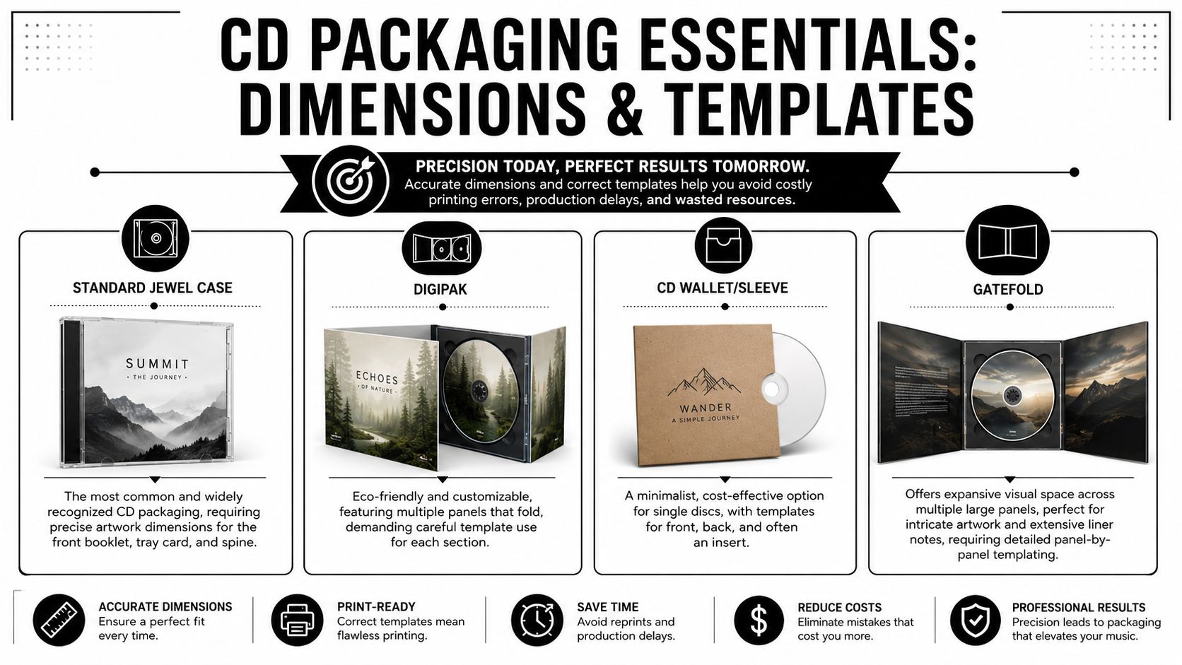
For a standard jewel case, Disc Makers’ production guidance recommends designing the front insert at 4.724 in x 4.724 in, the tray card at 5.906 in x 4.646 in, and adding 0.125 in bleed on all sides. Those numbers aren’t arbitrary. They give the printer room to trim cleanly without exposing an unintended border.
The three measurements that matter
When you set up cover art for CDs, keep these terms straight:
- Trim size is the final visible size after cutting.
- Bleed is the extra image area that extends past the trim line.
- Safe area is the zone where your important text, logos, and faces should stay so they don’t end up too close to the cut or fold.
Artists often understand the cover size but ignore the bleed and safe area. That’s how you get titles shaved at the edge or a face sliced by a fold.
Leave the background generous. Keep the critical content conservative.
CD packaging print dimensions with bleed
The table below uses the verified jewel case dimensions and converts them to pixels at 300 DPI, which is the standard print resolution discussed later in file prep.
| Packaging Type | Component | Dimensions (Inches) | Dimensions (Pixels @ 300DPI) |
|---|---|---|---|
| Standard Jewel Case | Front Insert | 4.724 x 4.724 | 1417 x 1417 |
| Standard Jewel Case | Tray Card | 5.906 x 4.646 | 1772 x 1394 |
Packaging choices and what they change
Different package styles create different design demands.
Standard jewel case
This is the familiar clear plastic case. It gives you a front insert, tray card, and visible spine area. It works well when you want a classic retail look and need room for back cover information.
The trade-off is precision. Spine text needs careful placement, and tray card art must account for the folded side spines.
Digipak
A digipak gives you more panel space and a more premium paperboard feel. It’s good for artists who want the package to feel more like a small art object.
The trade-off is template dependency. Every panel, flap, and fold has to be built from the correct dieline.
CD wallet or sleeve
This is lean, fast, and cost-conscious. It suits promos, sermons, event recordings, and short-run music projects where simplicity matters.
The trade-off is reduced visual real estate. You don’t have much room to hide weak design decisions, so the front concept has to do more.
Gatefold
Gatefold-style packaging gives artwork room to breathe. If you have liner notes, strong photography, or a concept release, this format can carry more storytelling.
The trade-off is production discipline. More panels create more chances for a panel mismatch, upside-down interior art, or fold alignment problems.
What to do before opening your software
Start with a real template for the exact package you’re ordering. Don’t design a square first and “figure out the back later.” That shortcut is where most production problems begin.
Use this sequence:
- Choose the package first: Jewel case, digipak, wallet, or gatefold.
- Download or request the matching template: The dimensions must match the actual print product.
- Mark bleed, trim, and safe area: Keep guides visible while designing.
- Place rough text early: If the track list doesn’t fit at the wireframe stage, it won’t magically fit later.
A template is not a suggestion. It’s the map your design has to follow.
Designing Cover Art That Connects With Your Audience
You finish the mixes, send the masters, and then the artwork becomes the delay. That happens all the time. The front cover looked fine on a phone, but once it has to sit on a printed package, a store thumbnail, and an order form, weak design choices show up fast.
Artists often assume memorable cover art for CDs comes from budget. In production, I see the opposite just as often. Restraint usually prints better, costs less to fix, and holds up across every place the artwork has to work.
Simple covers usually reproduce better, read faster, and survive size changes with fewer problems. That matters if you are ordering CDs through Atlanta Disc and also using the same front image for streaming, social posts, and merch table signage. One strong concept can carry all of that. A cluttered concept usually falls apart somewhere.
Simple beats busy
The weakest covers try to deliver every idea at once. Multiple textures, several fonts, heavy effects, a crowded photo composite, and tiny text all competing for attention. On screen, that can feel dramatic. In print, it often turns muddy.
The covers that hold up usually depend on one dominant idea:
- a portrait
- a symbol
- one object
- one scene
- one typographic treatment
That is not about following a trend. It is about control. If the viewer understands the image in one second, the cover has a better chance of being remembered.
A practical test helps. Shrink the front cover to thumbnail size on your screen. If the title disappears, the face gets lost, or the whole thing turns into visual noise, simplify it before you spend money printing it.
Low-budget choices that still look intentional
A small budget does not force bad design. It forces decisions.
Use one strong photo if you have it. A direct portrait, a live shot with clean lighting, or a single object tied to the release usually works better than a collage built from random assets. If your photo is average but honest, keep the layout clean and let the image do its job.
Type choices matter just as much. One display font for the artist name or title, plus one readable font for the track list and credits, is enough for most projects. More fonts usually create confusion, and they can make the package look older than the music.
Color is another place where artists waste good material. If the image already has a mood, use that palette. Do not force extra accent colors into the design just because they looked good in the app. Strong contrast also saves a lot of covers. Dark text on light space, or light text on dark space, prints more reliably than soft gray text floating over a busy midtone background.
Empty space helps.
It gives the title room, makes the cover feel deliberate, and keeps the final piece from looking cheap even when the budget is tight.
A cover does not need to look expensive. It needs to be readable, recognizable, and clearly tied to the music.
That same thinking saves time during ordering. If your front cover is clean and your back panel is not overloaded, proof review goes faster, track lists are easier to check, and there is less chance of last-minute revisions before production.
Later in the design process, it helps to study how other creators simplify ideas without flattening them.
Match the audience, not your software effects
Good cover art signals the kind of record it belongs to. Church and ministry CDs usually work better with calm imagery and clear type. Rap projects often need a stronger focal image and bolder title treatment. Podcasts, live events, and conference recordings usually benefit from direct branding that reads instantly.
The goal is fit. If the music is intimate, the artwork should not feel loud and chaotic. If the project is aggressive, polished, and high-energy, a timid cover sends the wrong message before anyone hears a track.
Effects are where a lot of self-designed covers go off course. Chrome text, distressed overlays, fake lens flares, and heavy glow treatments are easy to apply and hard to print well. Keep them only if they support the concept. If they are there because the software made them available, cut them.
A clear idea beats extra decoration almost every time. That is the trade-off artists should keep in mind from the start. The more visual tricks you stack into the file, the more chances you create for readability problems, muddy printing, and expensive revisions later.
From Design to Disc Prepping Your Files for Flawless Printing
Strong design can still print badly if the file is built wrong. Most of the avoidable problems in CD printing come from resolution, color mode, fonts, and exports.
Summit Sound’s file-prep guidance recommends building layouts in page-layout software such as Adobe InDesign or QuarkXPress, converting colors to CMYK, embedding fonts, exporting a high-resolution print PDF, and then reopening that PDF in Acrobat to confirm nothing shifted. That workflow holds up because print production needs stable files, not loose assets scattered across different apps and folders.
Start in the right software
For single-image mockups, Photoshop can be useful. For actual packaging layout, page-layout software is the safer tool. InDesign is standard for a reason. It handles linked images, typography, panel alignment, and PDF export far more reliably than trying to build the whole package in a casual graphics app.
If you’re designing a tray card with spines and multiple text areas, a layout program gives you control that raster-only tools don’t.
Resolution is not optional
For print CD cover art, raster images should be 300 DPI or higher at final size. That means the image needs enough real detail before it enters the layout.
What doesn’t work:
- Pulling from social media: Online images are often compressed and too small for print.
- Upscaling low-res art: Making a file physically larger doesn’t add real detail.
- Screenshot workflows: Screenshots flatten quality fast and create soft edges around text and logos.
What does work:
- Use original photos or exports
- Check image size at final placed dimensions
- Replace weak assets early instead of trying to rescue them late
If an image looks only “okay” on screen at full zoom, it usually prints worse than you expect.
CMYK versus RGB
Screens display color in RGB. Printing uses CMYK. That difference matters because some bright screen colors won’t reproduce the same way on paper.
Convert the artwork to CMYK before final export so you can judge the print result more accurately. If you leave everything in RGB until the end, the conversion may shift saturation or darken certain tones when the file is output for print.
The export that saves headaches
A high-resolution PDF is usually the safest delivery format because it packages layout, images, and typography into one controlled file. After export, open the PDF and inspect it carefully.
Check for these issues:
- Missing fonts: Text may reflow if fonts aren’t embedded.
- Layer surprises: Hidden elements sometimes appear or vanish unexpectedly.
- Color shifts: Rich black backgrounds and dark photos need review.
- Soft images: Zoom in and inspect edges, especially around logos and type.
One more point matters here. Don’t build everything right and then flatten your package into a poor-quality JPEG at the end. That’s a common self-inflicted problem. Keep the quality high all the way through export.
The Final Check Your Pre-Press Quality Control Checklist
The last review is where small mistakes either get caught or get printed. You don’t need a complicated approval process. You need a disciplined one.
A useful final check combines design judgment, technical review, and plain proofreading. That matters even more for no-budget releases, where the front cover often doubles as the main promotional image. The zero-cost strategy that holds up best is keeping the front focused on one iconic element and clear typography, as noted in this YouTube discussion on making no-budget cover art pop.
The pre-press checklist
Run through every item before upload.
- Read every word out loud: Artist name, album title, track list, credits, copyright line, and contact details. Your eyes skip familiar errors. Your voice usually catches them.
- Check the front at small size: Shrink it on screen. If the title disappears or the image becomes muddy, simplify before printing.
- Confirm the trim setup: Make sure bleed exists where it should, and make sure important content sits safely inside the cut area.
- Inspect placed images: Replace anything soft, noisy, or pulled from the web if it won’t hold up in print.
- Review black backgrounds carefully: Banding, compression artifacts, and muddy shadows show up fast in dark artwork.
- Verify the spines: Spine text should be centered, oriented correctly, and not too close to folds.
- Make sure fonts are stable: Embed them or convert to outlines if your workflow requires it.
- Open the exported PDF: Don’t assume the export preserved everything exactly.
What people miss most often
The most common misses are mundane. Wrong song order. A missing producer credit. Spine text on only one side. A background that doesn’t extend into bleed. A front title that looked bold on a monitor but feels tiny once printed.
These aren’t dramatic design failures. They’re rushed final-pass failures.
Print problems often begin with the sentence, “It’s probably fine.”
A practical approval habit
Do one silent check for layout. Then do one slow check for words only. Then step away and return for a final pass with fresh eyes. If another person can review the proof, even better. They’ll usually notice the typo or alignment issue you’ve been staring past for hours.
Treat the quality-control pass like mastering. Tiny changes at the end affect the whole release.
Bringing It All Together Ordering Your CDs with Atlanta Disc
Your masters are done, release date is circled, and the last thing you want is to stall the job because the package you ordered does not match the art you built. That happens all the time with independent releases. A front insert for a jewel case gets uploaded to a wallet order, or a disc face is approved while the back panel is still an older draft.
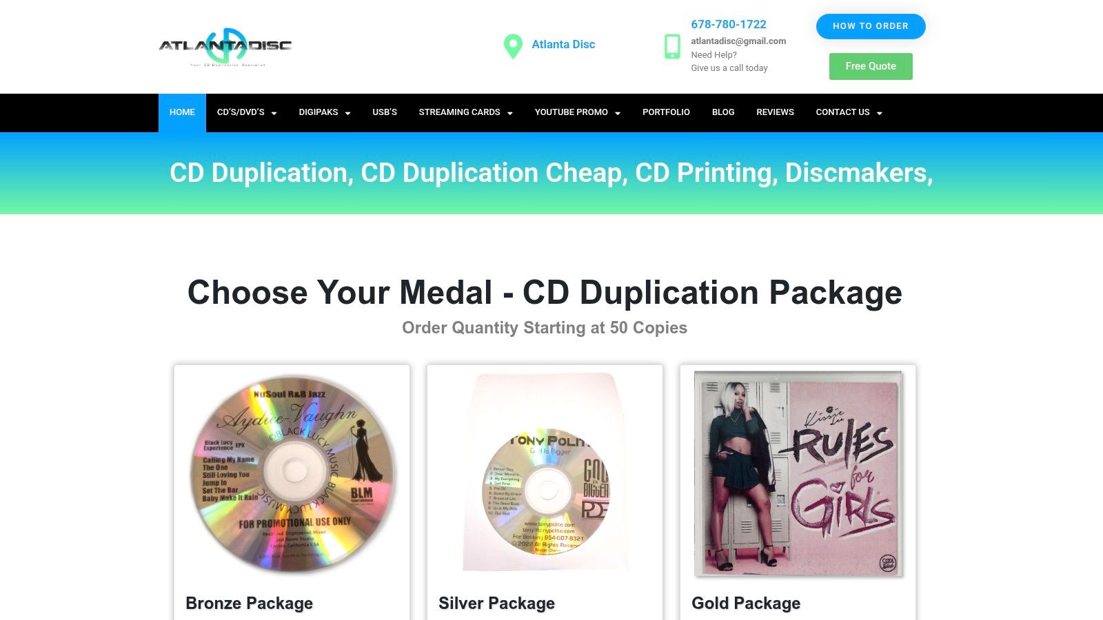
The cleanest orders start with one simple rule. Choose the packaging first, then upload only the files built for that exact package. If your artwork was designed on a jewel case template, order a jewel case package. If you built a digipak or wallet layout, keep the order aligned with that structure. Changing formats at the ordering stage usually means reworking panel sizes, spine widths, and folds. That costs time and can push back approval.
Before you upload, gather everything into one clearly labeled folder:
- Front insert or outer cover art
- Back panel or tray card
- Disc face art, if your package includes printed discs
- Final print-ready PDFs
- Any notes tied to credits, sequencing, or special instructions
File organization matters more than artists expect. “album_front_APPROVED.pdf” prevents confusion. “cover-final-final-2.pdf” creates it. At a duplication house, unclear filenames are one of the fastest ways to slow down a job because someone has to stop and confirm which file is current.
Atlanta Disc handles the packaging formats many indie artists order, including jewel cases, wallets, and digipaks. That makes the ordering side practical for low-budget releases. You can design to a real production option from the start instead of building art first and hoping a package will fit later.
What to check before you upload
A fast review here saves revisions later:
- Match each file to the package you selected
- Confirm panel orientation
- Make sure the approved PDF is the one being uploaded
- Use clear filenames for every component
- Include only current files, not older alternates or drafts
One more practical point. If you are keeping costs tight, avoid last-minute packaging changes after the design is finished. Rebuilding a sleeve into a jewel case set, or the reverse, is a small change on screen but a real production change in prepress.
Proof approval deserves your full attention
Once the order is placed, the proof is the point where you slow down and read everything again. I tell artists to review it like they are opening the finished shipment for the first time. Look for the mistakes that survive every internal review: wrong song order, inconsistent credits, a missing copyright line, disc art rotated incorrectly, or panel text that feels cramped once it sits in the actual package layout.
Check these items carefully:
- Track list and spelling
- Credits and legal text
- Panel placement
- Disc face positioning
- Readability at actual size
If something is wrong, fix it before approval. After production starts, changes usually mean extra cost or a delayed release.
The artists who get through ordering with the fewest problems are usually the ones who kept the process disciplined. They picked the package early, designed to the correct template, named files clearly, and treated the proof as a production document, not a quick formality.
https://www.atlantacdduplication.com