

Graphic Design Service: A Musician’s How-To Guide
You finished the record. The mixes are approved, the master is back, and now the job that seemed small suddenly feels huge. You need a cover, a tray card, a booklet, streaming graphics, maybe a poster, maybe a one-sheet, and somehow all of it has to look like the same release instead of five unrelated files.
That’s the point where a lot of independent artists lose time and money. They either rush into Canva with no print specs, or they hire a designer with a vague message like “make it dark and cinematic,” then spend the next week arguing in a group chat. I’ve managed enough indie releases to know where this goes wrong. The music can be excellent and still get presented like an afterthought.
A graphic design service for a music release isn’t just about making the cover look polished. It’s about translating the identity of the record into files that work everywhere you need them to work: Spotify, Bandcamp, a jewel case insert, a Digipak spine, a promo flyer, an EPK thumbnail, and the hands of a fan at the merch table.
Your Music Deserves More Than a DIY Cover
The most common bad scenario is simple. An artist spends months recording, then tries to finish the art in one weekend. The front cover gets all the attention. The back panel is rushed. The spine is an afterthought. Nobody checks whether the tracklist is readable at print size, whether the credits fit, or whether the black background will print the way it looks on a laptop.

I’ve seen this with rappers, singer-songwriters, church music teams, and small labels. The record sounds serious, but the visuals tell a different story. Promoters notice. Media people notice. Fans notice, even when they can’t explain why. A weak cover signals a weak release plan.
Design shapes perception before anyone presses play
Album packaging still does a job that streaming thumbnails can’t fully replace. It frames the record. It tells the listener whether this project is raw, polished, underground, nostalgic, minimal, loud, devotional, or commercial. Good design creates consistency across the whole campaign, not just the square cover.
A strong release package makes the music feel finished. A weak one makes the artist look unsure.
That’s one reason visual work remains a major commercial category. The global graphic design market is estimated at $45.8 billion in 2026, according to Next MSC’s graphic design market report. For musicians, the takeaway isn’t abstract. Businesses invest in design because presentation changes how people judge the product.
What a pro designer actually fixes
A solid designer doesn’t just “make art.” They solve practical release problems:
- Front cover clarity: They create a cover that still reads well as a tiny thumbnail.
- Physical packaging fit: They design for jewel cases, Digipaks, inserts, and spines without guessing dimensions.
- Campaign consistency: They adapt the same visual language to flyers, stories, banners, and release assets.
- Print readiness: They prepare files that won’t surprise you when ink hits paper.
That’s why hiring a real graphic design service often saves money, even when the upfront fee feels painful. Redoing bad artwork after you’ve started promoting the release costs more.
Finding the Right Graphic Design Partner
A band can spend months finishing a record, then lose a week chasing missing dielines, fixing unreadable spine text, and re-exporting files the printer rejects. I’ve seen that happen more than once. The right designer prevents those delays before they start.
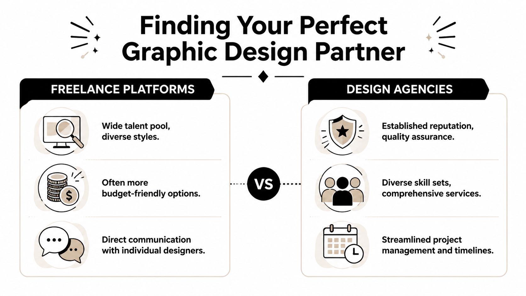
Independent musicians usually have three realistic hiring paths. Work with a freelancer, hire an agency, or use a design service tied to print or duplication. The best choice depends less on taste and more on how complex the release is, how clear your direction is, and who will carry the technical side of production.
Freelancers
Freelancers fit best when the release already has a clear identity and one person can make decisions. If the artist or label has references, approved copy, a settled tracklist, and print specs from the manufacturer, a good freelancer can work fast and keep costs under control.
That speed comes with a trade-off. You get direct communication, but you also depend on one person’s taste, availability, and production knowledge. A designer can make strong visuals and still be weak on back covers, inside panels, booklet pagination, or spine setup.
Freelancers are often the strongest option when you need:
- A specific visual style: Useful for genre scenes where artwork carries strong expectations, like metal, punk, hip-hop, ambient, or hardcore.
- Flexible scope: Easier to extend from album art into posters, social assets, or a one-sheet without adding layers of approval.
- Fast decisions: Good if the label, manager, or artist can give concise feedback and keep the process moving.
Agencies
Agencies make sense when the release is one part of a larger campaign. If you need ad creative, merch graphics, motion assets, rollout planning, and brand consistency across several formats, an agency can coordinate that work better than a solo designer.
For a small CD run, though, agencies often cost more than the project needs. You may end up paying for meetings, account management, and process that help bigger campaigns more than a six-panel Digipak.
A simple rule has saved me money. Hire an agency only when the release needs coordination across several moving parts, not just artwork.
Print-connected design services
For physical media, print-connected design services solve a problem generic design guides tend to miss. Good-looking artwork is only half the job. The file also has to survive production without last-minute fixes.
Designers who work close to duplication and packaging tend to make fewer preventable mistakes with bleeds, folds, tray cards, barcode placement, total ink coverage, and spine widths. That matters a lot for indie artists doing short runs, where a reprint can wipe out the margin on the whole release.
Atlanta Disc is one example of a company that offers design alongside print and duplication. That setup can reduce handoff errors if your priority is getting from approved artwork to manufactured CDs without avoidable back-and-forth.
How to judge a portfolio
Do not stop at whether the work looks stylish. Check whether the designer has solved the kind of job you are hiring for.
A strong music portfolio should show more than front covers. It should include the unglamorous pieces too. Back panels, spines, booklets, inside spreads, credits, and promo adaptations tell you whether the designer understands release packaging or just knows how to make a mockup look good on Instagram.
Use this checklist:
| What to check | What good looks like | Red flag |
|---|---|---|
| Music relevance | Covers, inserts, posters, release assets | Only logos or web banners |
| Typography | Readable credits and tracklists | Tiny type, crowded layouts |
| Print awareness | Clean spines, balanced back panels, proper layout logic | Front covers only, no packaging shown |
| Range | Different moods within a clear standard of quality | Same style pasted onto every client |
| Restraint | Knows when not to over-design | Effects stacked on every surface |
Ask these questions before hiring
The fastest way to avoid a bad fit is to ask practical questions before any deposit is paid.
- What physical formats have you designed before? Ask about jewel cases, Digipaks, tray cards, booklets, O-cards, and inserts.
- What final files do you deliver? You want print-ready exports and editable source files if future represses or lineup changes are likely.
- How many revision rounds are included? A fixed number keeps the project from drifting.
- Who checks the printer specs? Decide whether that responsibility sits with you, the designer, or the manufacturer.
- How do you handle text-heavy items? Credits, legal lines, catalog numbers, and barcode placement often separate experienced packaging designers from generalists.
- What is the turnaround if the printer flags a file issue? That answer matters more than the original delivery date.
Good answers are specific. Vague answers usually lead to extra revision bills, missed deadlines, or files that need repair right before manufacturing.
How to Brief Your Designer for Success
You approve a cover mockup on Tuesday. On Friday, the printer asks for spine width, bleed, barcode placement, and a back panel file nobody mentioned. The designer is waiting on missing credits. The band is still changing the track order. That mess usually starts with a weak brief, not bad design.
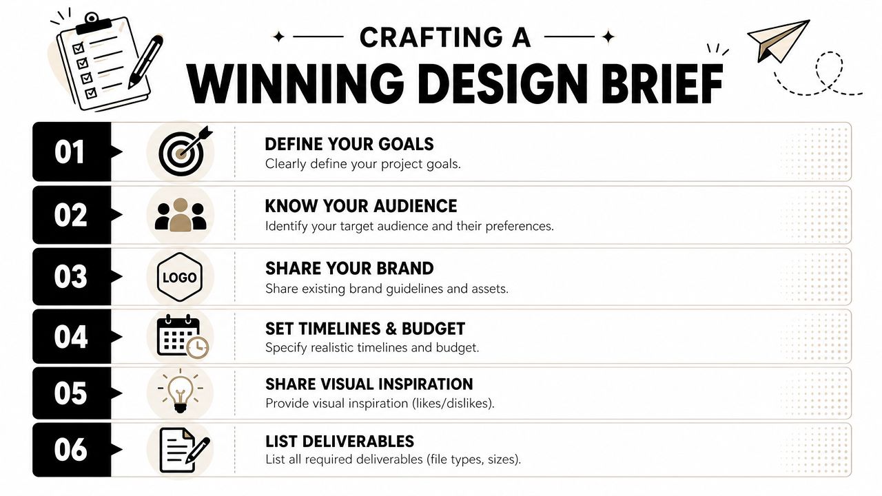
For indie releases, a good brief does two jobs at once. It gives the designer a clear creative direction, and it gives them the production facts needed to build artwork that can be printed on a CD package, booklet, tray card, or Digipak without last-minute repairs. Generic design briefs miss that second part. In music, that second part is where budgets get burned.
Define the release before you discuss visuals
Start with one plain-language page. No fluff. No label copy pasted from a press release.
Answer these five questions:
- What does the record sound like?
- What mood should the artwork carry?
- What do you want to avoid?
- Who is the release for?
- Where will this artwork need to appear?
The fifth question matters more than artists expect. A designer cannot build one square cover in isolation if the same visual idea also has to work on a six-panel Digipak, a disc face, a poster, a merch insert, and streaming thumbnails. Good packaging design is a system, not a single image.
List deliverables before style references
I learned this one the expensive way. If the brief says “album artwork,” everyone hears something different.
Write out every asset you need before moodboards, font talk, or color references:
- Physical packaging: front cover, back cover, spine, tray card, CD face, booklet, inside panels, O-card if needed
- Digital assets: streaming cover, banner crops, profile images, ad sizes, teaser graphics
- Promo materials: poster, show flyer, press graphic, review quote template, social post variants
- Final file types: print-ready PDF, web JPG or PNG, editable source files if agreed
That list protects both sides. The designer can quote properly. You can compare quotes properly. It also stops the slow creep where “can you also do…” turns a simple cover job into a full campaign without anyone resetting budget or timeline.
Here’s a useful visual primer before you write your own brief:
Send references that explain your taste
Reference links help only when you explain what you are pointing at. Ten album covers dropped into a chat thread do not tell a designer much.
Be specific about what you want them to notice:
I like the tight type hierarchy on this sleeve, the washed color palette on this poster, and the amount of empty space in this booklet layout. I do not want illustrated characters, fake vintage textures, or heavy glitch effects.
That gives the designer usable direction. It also reduces a common problem on indie projects: the band says they want “professional,” but each member means a different style.
Put the boring details in the brief
This is the part artists skip, then regret later.
Include:
- Artist name and final release title
- Final tracklist in the correct sequence
- Credits and legal lines
- Lyrics, thank-yous, catalog number, and barcode if they will appear
- Packaging format and printer dielines
- Manufacturing deadline
- Date needed for first concepts
- One person with approval authority
For physical media, printer specs are not admin trivia. They affect layout from day one. Spine width changes with page count and stock. Safe areas affect text placement. Black builds, bleed, and panel folds can make artwork look sharp or amateur once it hits paperboard. If the designer gets those details late, they either rebuild files or force design choices into the wrong template.
Give the designer the assets they actually need
A strong brief also states what you are supplying and what the designer has to source or create.
That includes band photos, logos, lyrics, credits, label copy, barcode, acknowledgments, and any existing visual assets from earlier singles. If nothing is ready yet, say that clearly. Designers can work around incomplete material for a first concept. They cannot finish production files without final text, final sequence, and approved specs.
I usually tell artists to lock their words before they obsess over colors. A changed song title after layout is annoying. A changed tracklist after the back cover, booklet, disc face, metadata, and distributor files are built is a real delay.
Budget like you are paying for production judgment
Design fees are not just payment for software time. They cover concept work, typography, image treatment, prepress setup, revision control, and the experience to catch print problems before your manufacturer catches them. The U.S. Bureau of Labor Statistics graphic designer profile gives a useful baseline for how professional design labor is valued in the market.
For indie labels and self-releasing artists, the cheaper option often gets expensive later. A low quote can still be the right choice if the scope is narrow and the designer knows print packaging. A higher quote can still be poor value if it covers nice mockups but no production discipline.
A brief template that saves time
Send the brief as a clean email, doc, or PDF using this structure:
- Project summary: one short paragraph describing the release
- Audience: who you want the artwork to connect with
- Visual direction: references, with notes on what you like and dislike
- Deliverables: every required asset for print and digital
- Supplied content: photos, logo, lyrics, credits, barcode, legal text
- Print details: format, dimensions, dielines, and printer requirements
- Schedule: concept date, revision windows, final file deadline
- Approver: one person responsible for sign-off
A good brief does not make the project less creative. It gives the designer enough clarity to spend their time solving the right problems: how to make the release look strong, read clearly, and survive contact with a real printer.
Managing the Creative Process and Feedback
Once the project starts, communication becomes the difference between a smooth release and a mess. Not talent. Not software. Communication.
A design-industry source reports that more than 13% of clients identify missed deadlines as their biggest problem when working with graphic designers, according to SketchDeck’s roundup on design and business performance. In music projects, I’d put unclear feedback right beside that. The two problems usually travel together.
Set one lane for approvals
Bands often wreck the process by letting everyone send comments separately. The singer texts one note, the producer emails another, the manager asks for a third change, and nobody notices the contradictions. The designer ends up solving politics instead of design.
Use one point person. That person collects comments, removes duplicates, resolves internal disagreements, and sends one clear response.
A good approval chain looks like this:
- Designer sends concept.
- Band discusses privately.
- One person sends consolidated notes.
- Designer revises.
- Final sign-off comes from the same person.
Give feedback that can be acted on
“Not feeling it” isn’t useful. Neither is “make it pop.” If something is wrong, explain what function isn’t working.
Try language like this:
The title is getting lost against the background at small size. Keep the mood, but increase contrast or change placement.
Or this:
The front cover feels right, but the back panel looks crowded. Prioritize tracklist readability over texture.
That protects the core idea while still directing the fix.
Respect milestones or pay for chaos
Every release needs checkpoints. I prefer three: concept approval, layout approval, and final prepress approval. If you skip those gates, late-stage changes hit everything at once. One text change can force a type resize, which shifts spacing, which affects the spine, which then affects print alignment.
Use milestones such as:
- Concept stage: Approve direction, image style, palette, and typography.
- Layout stage: Approve information hierarchy, panel structure, and copy placement.
- Final files stage: Approve spelling, credits, dimensions, and print setup.
Don’t give creative notes and factual corrections in the same sloppy message. Separate taste from errors.
Keep revisions finite
Musicians often ask for “a couple small tweaks” over and over. Designers hear that phrase and know the project is drifting. If the brief was solid, revision rounds should focus the work, not restart it.
When you review a draft, sort feedback into three buckets:
- Must fix
- Would improve
- Personal preference
That forces discipline. It also stops the band from spending an hour debating a texture nobody in the audience will ever notice.
Decoding Technical Specs for Print and Digital
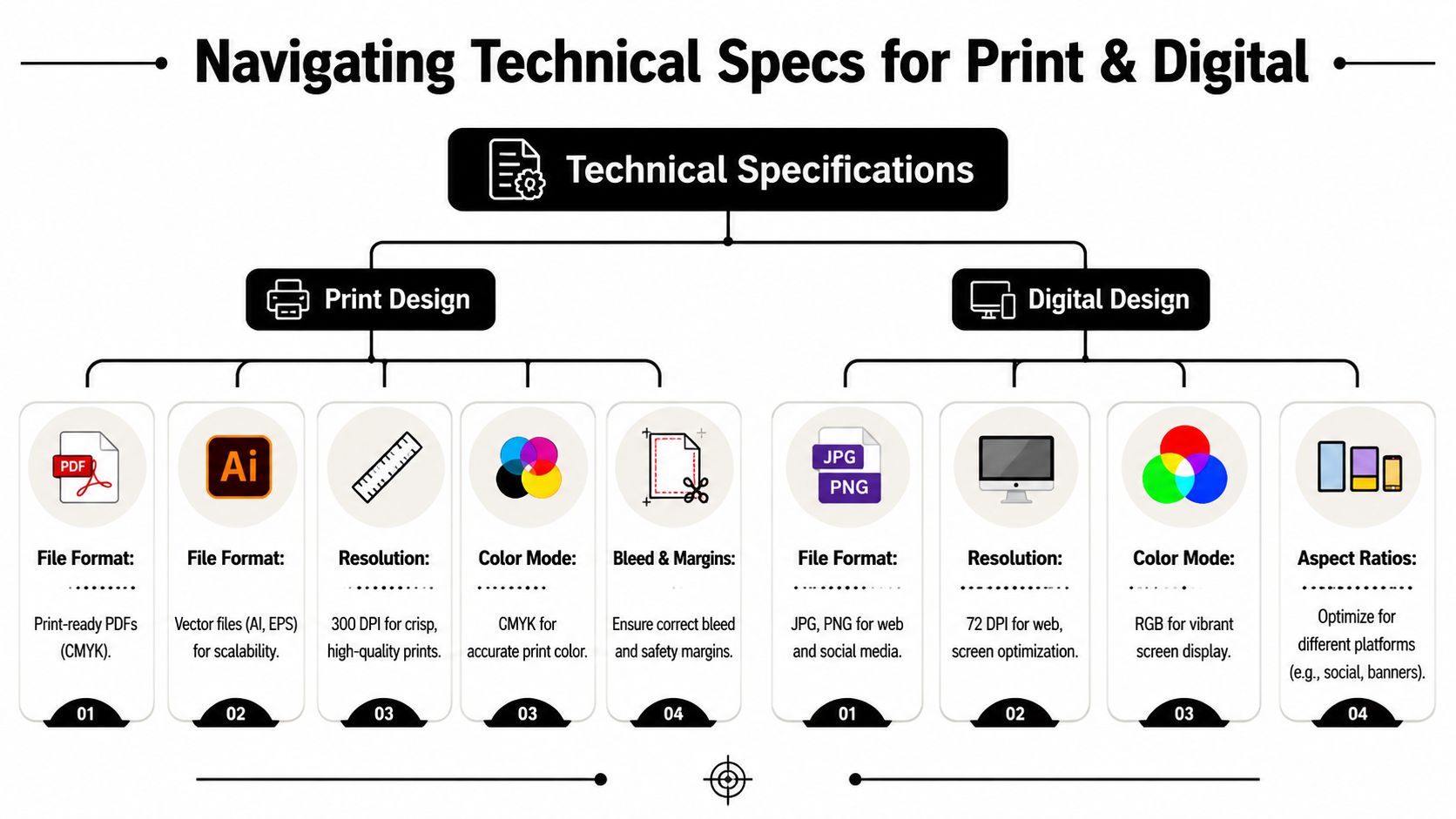
A design can look excellent on screen and still fail at the printer. In such cases, musicians often get burned, especially with CDs and Digipaks. Physical packaging has tolerances. Paper folds. Ink behaves differently than a glowing monitor. Tiny mistakes become visible fast.
The terms you actually need to understand
You don’t need to become a print technician, but you do need to approve files intelligently.
| Term | What it means in plain English | Why it matters |
|---|---|---|
| CMYK | Print color mode | Screen colors can shift when converted for print |
| RGB | Screen color mode | Best for digital use, not usually for print files |
| DPI | Image detail density | Low-resolution images print soft or blurry |
| Bleed | Extra image area beyond trim | Prevents white edges after cutting |
| Safe zone | Inner area for important text | Keeps titles and credits from being trimmed |
| Vector | Scalable artwork format | Best for logos and type-driven elements |
If you remember one thing, remember this: a file that is “high quality” in a text message or on Instagram is not automatically print-ready.
What matters for CDs and Digipaks
Music packaging combines design and mechanical accuracy. The front may be expressive, but the spine and inside panels are unforgiving. If the spine width is off, text can drift. If the fold area isn’t respected, faces and titles can land in awkward places.
Check these items before approving print files:
- Spine text: Is it centered and readable?
- Tracklist size: Can a normal person read it without squinting?
- Credits and legal copy: Are names spelled correctly?
- Bleed area: Does the background extend beyond the trim edge?
- Safe margins: Is important text pulled in from folds and cuts?
- Black backgrounds: Do they look intentional, not muddy or washed out?
File formats and handoff
Most musicians ask for a JPG and think they’re done. For real release management, that’s not enough. You usually need different outputs for different jobs.
Common needs include:
- Print-ready PDF for packaging production
- JPG or PNG for web, socials, and press use
- Editable source files if your agreement includes them
- Linked assets and fonts information where relevant
One of the most overlooked issues in a graphic design service is ownership of editable files and production assets. Top Nonprofits’ discussion of nonprofit graphic design needs highlights how handoff terms around source files, fonts, stock assets, and editable materials can prevent future operational and legal problems.
That matters in music because releases get reused. A year from now, you may want a vinyl adaptation, an anniversary edition, a lyric video thumbnail set, or a tour poster using the same visual world. If you don’t know what you own, every small update becomes a new negotiation.
Ask for this before the project closes
Don’t wait until after final payment to bring this up.
Ask:
- Which final files are included?
- Are source files included or licensed separately?
- Are any fonts restricted?
- Are stock images licensed for your intended use?
- Will layered files be organized enough for another designer to use later?
That handoff conversation feels boring right up until you need a reprint in a rush.
Avoiding Common Pitfalls and Finalizing Your Project
A week before street date, the printer sends a preflight warning. The spine text is outside the safe area, one image is low resolution, and the back tray card still lists the wrong running order. I have seen that email too many times. It usually starts long before prepress. The trouble comes from loose approvals, drifting copy, and treating print production like a last-minute export instead of part of the release plan.
For indie musicians putting out CDs or Digipaks, the last stage is where creative taste meets manufacturing reality. A cover can look great on screen and still fail at the plant. That gap costs money. It also costs release momentum if you miss a launch window, delay mailouts, or have to reprint because nobody checked the booklet credits against the final master.
The mistakes I see most often
These are the problems that keep showing up:
- Changing the concept after approval: A new visual direction late in the job means extra rounds, extra cost, and rushed production files.
- Letting too many people approve details: Five band members, a manager, and a friend with “one note” will drag a project off course fast.
- Treating printer templates casually: Fold lines, bleed, safe zones, spine width, and panel order have to match the packaging format exactly.
- Dropping in unlicensed assets: Random fonts, textures, and stock images can create legal and production headaches later.
- Rushing the final proof: Typos, wrong credits, missing logos, and barcode problems are much cheaper to catch before sign-off.
One mistake matters more than artists expect. Copy changes at the end do not just change text. They can reflow a lyric panel, shift spine alignment, move legal lines, or force a barcode into a bad spot. On a Digipak or multi-panel booklet, one late edit can ripple through the entire package.
A cleaner way to close the project
Freeze the copy before the designer prepares final production files. That includes song titles, credits, thank-yous, catalog number, copyright line, label name, and distributor or collection society information if you use it.
Then run a final proof in two separate passes.
The first pass is for content. Check spelling, track sequence, guest credits, producer and writer credits, copyright text, and barcode number. Use the final mastered sequence, not an older draft from the session folder.
The second pass is for production. Check trim, bleed, spine width, panel order, image quality, black text treatment, and whether anything important sits too close to a fold or cut line. For CD releases, that practical review matters more than another debate about whether the type should be two points larger.
Final approval transfers risk. If you sign off on a file without checking the details, the cost of a bad print run usually lands on your side.
Your wrap-up checklist
Before the project closes, confirm that you have:
- Approved print files that match the exact packaging format
- Digital artwork sized for streaming platforms, web stores, and promo posts
- A final proof reviewed against the mastered tracklist and credits
- Source files if they are part of your agreement
- Licensing notes for fonts, stock, or third-party artwork
- A written record of approvals, file versions, and ownership
- Final invoice and payment confirmation
Good designers notice problems. Good label management prevents them from reaching the printer in the first place.
If the project went well, keep that designer close. Reliable artwork people who understand both music branding and print setup are hard to replace, especially when you need a fast repress, a tour insert, or a vinyl adaptation six months later.
If you need a practical option for CD artwork, short-run packaging, and related promo print needs, Atlanta Disc offers duplication, printing, and graphic design services geared toward indie releases. That kind of connected workflow can help when you need design and manufacturing aligned for CDs, Digipaks, inserts, flyers, and other physical release materials.